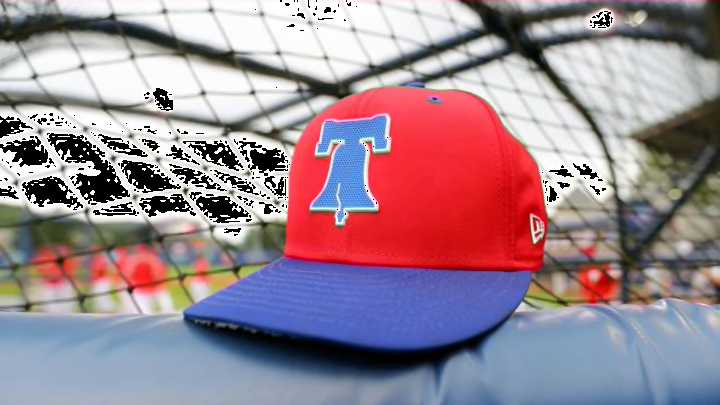
On Saturday, the Philadelphia Phillies released photos of their redesigned logo. Like most MLB logos, people were quick to judge them.
While the new logo is less than perfect – it’s actually unbalanced, Phillies fans will certainly buy gear to support their favorite MLB team.
What I love the most about MLB logos is that teams have so many. From the on-field logos to the Players’ Weekend choices, there is truly something for everyone.
The Phillies aren’t the only team to have updated their logo for 2019. The Marlins also redesigned theirs to feature a marlin that curves around the stitches of a baseball and the word “Miami” in an attractive font that fits the style of the city. Gone is the big block M that so many people disliked.
🚨👀 #Phillies new logo 👀🚨 Men’s and ladies tees featuring the new Phils’ primary logo available today, only at the ballpark. You likey? pic.twitter.com/UrCoAjY93K
— New Era Phillies Team Store (@philliesNEstore) December 7, 2018
The best logos clearly identify the team, look great on gear, and have a timeless quality to it. Of course, logos like the Old English D, the BoSox B, and the interlocking NY are iconic in their timelessness. They look great on hats and on the chests of players. But, logos also need a bit of creativity in them and these classic logos just don’t have that.
📲📲📲📲 #WallpaperWednesday x #OurColores pic.twitter.com/IDTTASXPwZ
— Miami Marlins (@Marlins) November 21, 2018
Some of the most creative logos in baseball are actually in the minor league, but many are just silly. Consider the Fort Wayne Tin Caps which is an angry apple wearing a pot on its head. Or the newly released Las Vegas Aviators logo which is a man’s face partially covered by a pilot helmet with goggles that feature the outline of the mountains near Vegas. On the surface, it’s a bit edgy, but the goggles have straps on them that would cover the pilot’s eyes. The proportions are off. See for yourself:
The feels are flying high today! ✈️ Thank you to all of our Las Vegas baseball fans for attending our team name unveiling event yesterday in @DTSummerlin. pic.twitter.com/Xv6soBfTtO
— Las Vegas Aviators (@AviatorsLV) December 9, 2018
Looking through the 2018 and 2019 logos that are available for purchase in fan-gear shops and that are worn by players on the field, there are some that are better than the others. These include the everyday logos as well as those worn during the Players’ Weekend.
