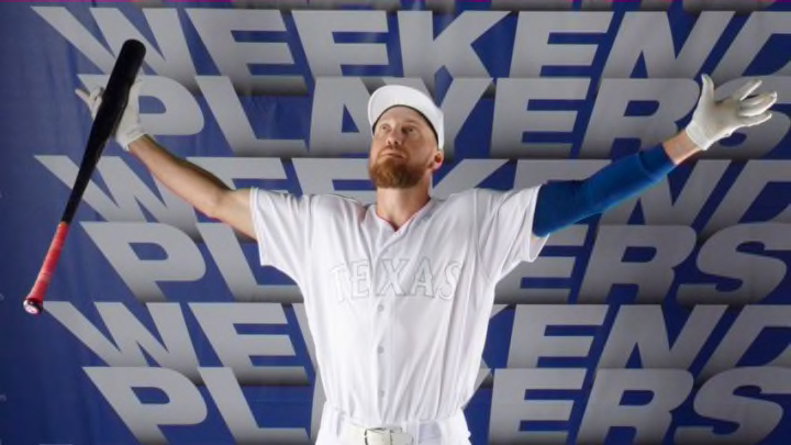
MLB Players wore all-black or all-white uniforms that were unreadable for Players Weekend, obscuring the individuality that makes the weekend special.
The Tampa Bay Rays played the Baltimore Orioles at Oriole Park at Camden Yards this weekend.
At least that’s what the schedule said. As for people actually at the park or tuning in on TV, they’d just have to take the teams’ word for it.
Easily the biggest letdown on “Players Weekend” was MLB’s decision to homogenize the uniforms. No matter the team’s traditional colors, MLB players from one team wore black-on-black Friday and the other team wore white-on-white.
More from Call to the Pen
- Philadelphia Phillies, ready for a stretch run, bomb St. Louis Cardinals
- Philadelphia Phillies: The 4 players on the franchise’s Mount Rushmore
- Boston Red Sox fans should be upset over Mookie Betts’ comment
- Analyzing the Boston Red Sox trade for Dave Henderson and Spike Owen
- 2023 MLB postseason likely to have a strange look without Yankees, Red Sox, Cardinals
It made every game look like a bunch of outlaws raiding a wedding. Beyond that, since umpires were also wearing all black, every game looked like it was 13 against nine.
To all fans except those with 20-10 vision, far and away the biggest problem was the virtual impossibility of actually reading anything imprinted on the uniforms. This included team logos, player numbers, and – most significantly for Players Weekend – the often clever nicknames players had given themselves.
And it didn’t matter to MLB what a team’s actual colors were. The Cincinnati Reds came to Pittsburgh to play the Pirates attired in not one jot of red. Instead, Reds players wore full white – in several cases including their belts and caps. Even the Reds logo was imprinted in subdued grey – against white.
If you want to hide something, paint it light grey against a white background.
The same appeared to be true of every team debuting Players Weekend uniforms. It was as if Henry Ford had been put in charge of design: you can have any color you want as long as its black or white.
Sometimes the uniforms weren’t even uniform. Reds pitcher Anthony DeSclafani topped his white uniform with a black cap while his teammates playing the field behind him wore white ones.
Particularly on Players Weekend – when the idea is to emphasize individuality – the designer of the uniforms may have benefitted from a reminder that there is no point in imprinting MLB players nicknames on the backs of their uniforms if those nicknames cannot be read. It’s fine to abstractly wonder whether there’s a deeper meaning to Evan Marshall’s nickname, “Forgetting Sarah.” But assuming Marshall gets in a game this weekend, wouldn’t you like to actually be able to see it on his back?
Or are you comfortable taking MLB’s word that’ it’s there?
The idea behind the weekend, guys, was to show off. all-black or all-white attire is the opposite of showing off.
The shame is that MLB came agonizingly close to doing something truly radical in those color choices. Had, for example, the unis gone all the way – literally all black or all white, stripped of the team logos nobody can read anyway and including white caps for the home teams – that would have been something radical.
As it is, MLB’s Players Weekend uniform scheme was a clear swing and a miss because the difficulty in reading the printing created a distraction without the offsetting benefit of true innovation.
